Google Messages is testing a significant redesign of pinned chats and search on the homepage to modernize user interface navigation.

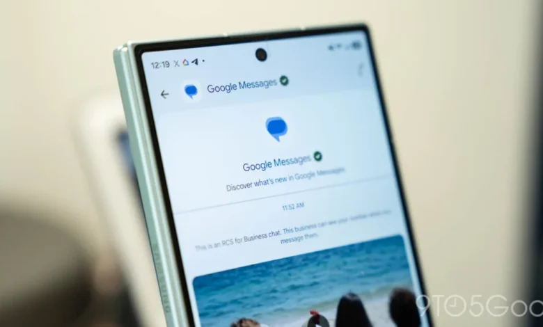
The latest experimental build of the Google Messages application suggests that the development team at Google is looking to fundamentally alter how users interact with their primary communication hub. By shifting away from the traditional list-based layout for priority conversations, the company is attempting to align its messaging interface with modern mobile design languages, most notably those found in Apple’s iMessage ecosystem. These changes, currently observed in the beta channel, reflect a broader strategy to refine the user experience as the application continues to integrate advanced features like RCS (Rich Communication Services) and generative AI capabilities.
The Evolution of the Pinned Chat Interface
Historically, Google Messages has maintained a standard list view where pinned conversations are distinguished primarily by a small pin icon, remaining integrated within the vertical stack of active messages. In the current iteration, users can pin up to three conversations to the top of their inbox, ensuring that frequently contacted individuals or groups remain easily accessible.
The proposed redesign marks a departure from this approach by creating a dedicated visual layer at the top of the interface. Instead of text-based list items, the new layout utilizes prominent contact avatars arranged horizontally. This design choice effectively separates "pinned" contacts from the general message feed, creating a clear visual hierarchy. By elevating these contacts above the standard list, Google is prioritizing quick access over the display of contextual metadata.
However, this design shift brings notable trade-offs. Similar to the layout employed by Apple’s iMessage, the new "pinned" row prioritizes visual identity over informational content. Consequently, users will no longer see the latest message snippet or the timestamp of the last interaction for these pinned chats without first tapping into the conversation. For users who rely on the message preview to triage their inbox, this change may represent a loss of functionality, emphasizing the tension between aesthetic minimalism and data-dense utility.
Revolutionizing Navigation with Floating Action Buttons
Alongside the changes to pinned chats, Google is experimenting with a revamped approach to the application’s core navigation tools: search and new message composition. Currently, the "Start chat" button is a standalone element in the lower-right corner of the interface, while the search bar occupies a fixed position at the top of the screen.
The experimental version introduces a dynamic, centered floating action button (FAB) that merges these functions. When the user is at the top of the inbox, the button displays a combination of a magnifying glass icon and a "Start chat" label, rendered in an elongated, pill-shaped container. As the user begins to scroll through their message history, the interface triggers an animation that collapses the button, shifting the focus to a more compact, singular "Search" action.
This design pattern—often referred to as a "smart FAB"—is increasingly common in Material You design implementations. It is specifically optimized for one-handed operation on modern, taller smartphone displays. By bringing the search function closer to the thumb’s natural resting position, Google is addressing long-standing user complaints regarding the reachability of the top-mounted search bar. Furthermore, the fluid, responsive animation associated with this button provides a tactile feedback loop, enhancing the overall "feel" of the application’s responsiveness.

Contextual Background and the Role of Gemini
It remains unclear how this new navigation structure will integrate with the existing Gemini AI integration. Since Google introduced its generative AI model into the Messages platform earlier this year, the Gemini button has occupied a prime spot in the interface, often competing for space with standard messaging tools.
The integration of Gemini represents a pivot in Google’s strategy, moving from a pure messaging utility to an AI-powered personal assistant platform. By embedding search and creation tools into a single, adaptive button, the company may be creating room to eventually consolidate AI-driven features into the main navigation flow. Analysts suggest that if the current test proves successful, Google may move toward a "modular" UI where specific actions—such as summarizing threads or drafting replies—could be triggered directly from the main inbox view via these refined interaction points.
Chronology of Google Messages Updates
The transition to this new design is part of a multi-year effort to unify the messaging experience across the Android ecosystem.
- Mid-2023: Google accelerated the rollout of RCS (Rich Communication Services) as the default standard, pushing for global adoption to compete with proprietary messaging platforms.
- Late 2023: The "Material You" design language was fully implemented, introducing dynamic color themes that adapt to user wallpaper settings.
- Early 2024: The introduction of "Magic Compose," utilizing generative AI to assist in drafting messages, marked the start of the app’s transformation into an AI-centric platform.
- Late 2024: The introduction of a refreshed app icon, featuring a gradient-heavy design, signaled a broader visual refresh of the entire suite of Google communication apps.
- Current Phase (Late 2026): Testing of the "Horizontal Pinned" layout and the adaptive FAB signifies the third major UI overhaul in as many years, focusing on user ergonomics and visual clarity.
Implications for User Behavior and Accessibility
The move toward an avatar-based pinning system is not merely cosmetic; it changes how users cognitively process their inbox. By shifting from a list-based, text-heavy interface to a visual, icon-based one, Google is essentially "gamifying" the most important contacts. This can speed up navigation for power users who have memorized the profile pictures of their primary contacts, but it may prove detrimental to accessibility. Users with visual impairments or those who rely on high-contrast text identifiers may find the loss of text-based previews in the pinned section a barrier to efficient communication.

Furthermore, the "Search" button’s new prominence suggests that Google is attempting to make message history more discoverable. With the average user now storing thousands of messages—including images, documents, and links—search has become a critical feature rather than a secondary utility. By placing the search function in a floating button, Google is betting that users will be more likely to query their archives if the tool is always within reach.
Industry Context and Competitive Dynamics
In the highly competitive landscape of messaging applications, Google is fighting on two fronts: against Apple’s iMessage and Meta’s WhatsApp. Apple has recently moved toward more complex UI structures in iMessage to accommodate "Apps" and "Stickers," while WhatsApp has maintained a more utilitarian, conservative approach.
Google’s strategy appears to be a hybrid of the two. By mimicking the aesthetic of iMessage—specifically with the pinned contact avatars—Google is attempting to reduce the "switching cost" for users moving from iOS to Android. Simultaneously, by keeping the interface rooted in Material You principles, it maintains the distinct identity that Android users have come to expect.
Future Outlook and Beta Testing
As of the current reporting, these features are confined to a limited beta rollout. Google traditionally utilizes this "dogfooding" and public beta phase to collect telemetry data on user engagement. Key metrics, such as the click-through rate of the new FAB versus the old one, and the number of users who actually pin contacts in the new layout, will likely dictate whether these features are pushed to the stable release.

Industry observers suggest that if the feedback is positive, a wider rollout could occur in the first quarter of the following year. However, if the removal of message snippets in the pinned section leads to negative user sentiment, the team may opt to reintroduce a "compact view" that displays both the avatar and the last message content.
Ultimately, these updates underscore a period of intense experimentation for Google. As the company continues to refine its communication software, the emphasis is clearly shifting toward a balance of AI integration and user-centric ergonomics, aiming to make the act of messaging not just a task, but a seamless, integrated digital experience.