Google is bringing its Liquid Glass design language to iOS apps to bridge the gap between Android and Apple ecosystems.

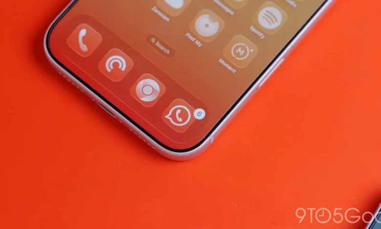
One year after the initial introduction of "Liquid Glass"—a design aesthetic characterized by translucency and depth—Google has begun a systematic rollout of this visual language across its suite of iOS applications. This transition represents a significant shift in how Google approaches UI/UX consistency on Apple’s mobile platform, moving away from the rigid, opaque elements of the previous Material Theme toward the more fluid and modern "Material 3 Expressive" design system.
The Evolution of Google’s Design Language
Google’s design journey on iOS has historically been a balancing act. The company must adhere to Apple’s Human Interface Guidelines while maintaining a brand identity that feels distinctly "Google." For years, the company relied on the Google Material Theme, a set of design principles that emphasized bold colors, card-based layouts, and solid backgrounds. While functional, these elements often felt alien within the iOS ecosystem, which has long favored translucency, blur effects (often referred to as "Glassmorphism"), and intuitive gesture-based navigation.
Liquid Glass serves as Google’s answer to this. By incorporating translucent materials, the design language allows content to "bleed" through navigation bars and floating action buttons (FABs), creating a sense of physical depth. The integration of Material 3 Expressive, which focuses on larger targets, dynamic typography, and more refined corner radii, ensures that these apps feel responsive and native to the iPhone experience.
Implementation in Google Photos and Google Health
The most prominent update in this rollout is visible in the Google Photos application. As of version 7.94, the floating bottom navigation bar—a staple of the app’s mobile interface—has shed its opaque, solid-color background in favor of a Liquid Glass treatment. This change is not merely cosmetic; it fundamentally alters the user’s perception of the interface.
By allowing the underlying imagery to remain visible behind the navigation elements, the app feels more immersive. Users now have the option to toggle between a "Default" translucency level and a "More clear" setting, providing a level of granular control that is rarely seen in mainstream mobile app design. In Dark Mode, this effect is particularly striking; the default blue accent color of the app subtly tints the active tab indicator, providing a sophisticated contrast against the blurred background.
![Google combines Material 3 Expressive & Liquid Glass on the iPhone [Gallery]](https://9to5google.com/wp-content/uploads/sites/4/2026/03/Liquid-Glass-dock-on-iPhone-17-Pro-Max.jpg?quality=82&strip=all&w=1600)
Furthermore, Google has extended this treatment to its health-tracking applications. The Google Health interface now features a refreshed bottom bar that utilizes the same frosted, semi-transparent aesthetic. The "Ask Coach" floating action button (FAB) has also received a frosted treatment, allowing it to blend seamlessly into the background while maintaining its visual hierarchy as a primary interactive element.
A Chronological Shift Toward Material 3
The transition to Material 3 is part of a multi-year effort to modernize Google’s software portfolio. Since the introduction of Material 3, Google has been slowly sunsetting the older Material Theme across its entire ecosystem.
- Early 2024: Google introduces "Liquid Glass" as an experimental design language aimed at improving visual harmony between OS platforms.
- Mid-2024: Initial tests begin in secondary apps, focusing on icon sets and typography updates.
- Late 2024: Google Tasks receives a full Material 3 overhaul, signaling that the company is ready to scale the design language to its core productivity suite.
- Early 2025: The current rollout begins, targeting high-usage apps like Photos and Health, while simultaneously addressing lingering UI inconsistencies in Docs, Sheets, and Slides.
Despite these strides, some applications remain behind. Google Docs, Sheets, Slides, and Keep have been noted as "stragglers" in this migration. These apps represent a complex challenge for developers because they require high-density information displays where translucency could potentially impede readability. The delay in updating these tools likely stems from the need to balance the aesthetic benefits of Liquid Glass with the functional requirements of enterprise-grade productivity software.
The Dynamic Color Dilemma
A significant point of discussion regarding Google’s design strategy is the absence of "Dynamic Color" on iOS. On Android, Dynamic Color—part of the Material You initiative—allows the system to extract colors from a user’s wallpaper and apply them as accents throughout the OS and compatible applications.
On iOS, this remains a missing piece of the puzzle. Google has yet to implement a mechanism for Dynamic Color on Apple’s platform, and for good reason: the technical limitations of iOS prevent third-party applications from accessing system-level wallpaper data in the same way they do on Android. While Google could theoretically introduce a manual setting—allowing users to select a custom color palette that persists across all Google apps—the company has shown no public intent to do so.
Critics argue that without access to the system wallpaper, a fully automated color-theming system would be "pointless" or redundant. Instead, Google has opted for a consistent, curated set of accent colors, ensuring that its apps maintain a recognizable "Google" look regardless of the user’s device customization.
![Google combines Material 3 Expressive & Liquid Glass on the iPhone [Gallery]](https://9to5google.com/wp-content/themes/ninetofive/dist/images/google-preferred-source-badge-dark.png)
Implications for the Competitive Landscape
The move toward Liquid Glass and Material 3 is more than a design refresh; it is a strategic repositioning. By making its apps feel more "at home" on iOS, Google lowers the friction for users who might otherwise prefer native Apple alternatives (such as Apple Photos or Apple Health).
From a product development standpoint, the move toward unified design language across platforms—even with platform-specific tweaks like Liquid Glass—reduces long-term maintenance costs. By building on a shared Material 3 foundation, Google’s design teams can iterate faster, ensuring that new features appear simultaneously across Android and iOS without requiring entirely separate UI engineering teams for each platform.
Analytical Perspective: Form Follows Function
The professional consensus among UI designers is that Liquid Glass improves the "perceived performance" of an application. By creating a visual connection between the content and the UI elements, the app feels lighter and more responsive. However, the success of this design language relies heavily on accessibility. High-contrast text against a blurred, translucent background can be difficult for visually impaired users to navigate. Google’s commitment to Material 3—which includes rigorous accessibility guidelines—suggests that these updates are being stress-tested to ensure that the aesthetic "frosted" effect does not compromise the readability of labels or the visibility of icons.
Conclusion and Future Outlook
As Google continues to phase out its older design languages on iOS, the path forward is clear: the company is doubling down on a design aesthetic that feels both distinctly Google and natively iOS. While the lack of Dynamic Color remains a differentiator that reinforces the boundaries between Android and iOS, the adoption of Liquid Glass is a significant victory for user experience.
Looking ahead, users can expect the remaining Google productivity apps to follow suit in the coming months. As these apps transition, the focus will likely shift toward refining the "expressive" nature of the design—finding new ways to use motion, depth, and typography to make the interaction between the user and the software feel more organic. For now, the rollout in Google Photos and Google Health serves as a preview of the refined, modern, and cohesive ecosystem Google is building for its users on Apple hardware.