Google Messages Redesign Sparks Debate Among Beta Testers Over iOS-Inspired Pinned Chats and Floating Search Buttons

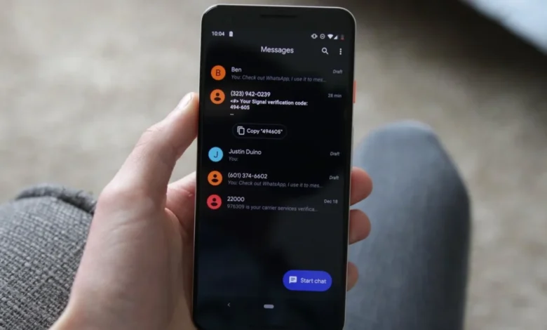
Google is currently testing a substantial visual and functional overhaul of its flagship messaging application, Google Messages, rolling out a revamped layout to select beta testers. The updates introduce a prominent, iOS-inspired interface for pinned conversations, a complete repositioning of the search utility, and a series of dynamic animations designed to modernize the user experience. However, the redesign has triggered a polarized response within the Android community, balancing praise for improved aesthetics against criticisms regarding screen real estate and functional efficiency.
The Evolution of Google Messages and the Rise of Rich Communication Services (RCS)
To understand the context of Google’s ongoing interface iterations, one must look at the strategic evolution of Google Messages over the past half-decade. Historically viewed as a basic utility for sending SMS and MMS messages, the application has transformed into Google’s primary vehicle for modern mobile messaging. The catalyst for this transformation has been the widespread adoption of Rich Communication Services (RCS), an advanced protocol designed to replace traditional text messaging with features long standard in third-party apps like WhatsApp, Telegram, and Apple’s iMessage.
With RCS, Google introduced end-to-end encryption, typing indicators, read receipts, high-resolution media sharing, and robust group chat functionalities. As Google Messages absorbed millions of users—cemented further by Apple’s recent decision to adopt RCS support for cross-platform messaging between iOS and Android—the application’s user interface has faced increasing scrutiny. Google has continually experimented with Material You design principles, dynamic color themes, and organizational tools to manage the growing volume of personal and business communications handled by a single app.
Anatomy of the Redesign: Pinned Chats and Layout Shifts
The most prominent feature of the new beta rollout (observed in build version 20261030_00_RC00 and similar recent packages) is the reorganization of pinned conversations. Previously, pinned chats were integrated directly into the standard message list, distinguished primarily by a small pin icon next to compact contact entries.
In the newly tested interface, Google has established a dedicated, distinct visual tier at the very top of the home screen for pinned chats. This layout features significantly larger contact avatars and a more spacious grid or row structure. This design choice bears a striking resemblance to the conversation pinning mechanics found in Apple’s iOS Messages app.
While the change offers a more visual, prominent method for users to access their most frequent contacts, it has introduced distinct layout trade-offs. Because the dedicated pinning area commands vertical space at the top of the display, the standard message feed is pushed downward. Consequently, users with multiple pinned items must scroll further down the screen to access recent unpinned conversations, altering the muscle memory and navigation speed long established by previous versions of the app.
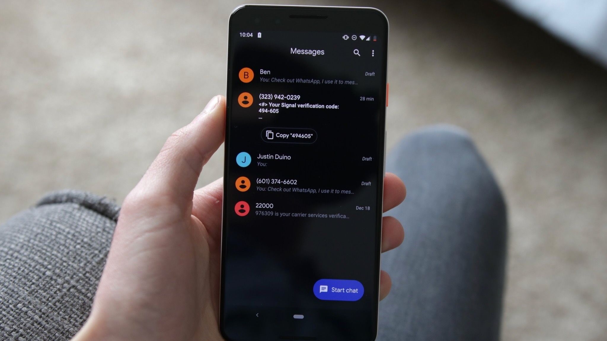
Early community feedback gathered across developer forums and social platforms, including Reddit, highlights these conflicting experiences. Proponents of the change argue that the larger contact avatars make important chats instantly recognizable, lending a cleaner and more organized appearance to the application’s home screen. Conversely, detractors contend that the layout introduces unnecessary whitespace, creates clutter, and feels unoptimized for users who prefer dense information presentation over aesthetic minimalism.
Furthermore, early adopters noted minor visual anomalies during the transition phase. For instance, when a user pins only a small number of conversations—such as two or three—an awkward empty placeholder space appears within the dedicated pinning grid. This placeholder resolves only when the user approaches the maximum threshold of pinned chats, which early estimates suggest may be capped around six to twenty depending on the specific device configuration and previous limits. Testers have also reported occasional choppy animations when scrolling or transitioning between views, indicating that the feature remains in an active optimization phase.
Repositioning Search and Multitasking Shortcuts
Beyond the visual restructuring of pinned threads, Google is experimenting with a fundamental reconfiguration of the in-app search functionality. Historically anchored at the top of the message list or accessible via a persistent search bar, the search tool in the new beta version has been decoupled from its traditional home.
Instead, Google has introduced a floating action button (FAB) positioned adjacent to the primary "Start chat" button. This floating element dynamically shifts its morphology based on the user’s scroll position, alternating between a circular magnifying glass and an expanded, pill-shaped search button. This contextual design aims to keep search capabilities readily available without consuming static screen header space.
However, the relocation has left some beta testers disoriented. Traditional Android interface design heavily relies on predictable top-bar placements for global search functions. Shifting search controls to a floating bottom-right position draws direct inspiration from floating navigation paradigms popularized by productivity and creative applications, but its utility in a high-frequency messaging environment continues to be evaluated by the user base. Additionally, the final placement of AI-driven shortcuts—such as integration points for Google Gemini—remains ambiguous within this new layout, leaving developers and power users speculating on how generative tools will be embedded into the revised navigation hierarchy.
Rollout Strategy and Server-Side Control
Google has deployed this redesign using its customary staged rollout methodology. Rather than delivering the interface update strictly through a monolithic Google Play Store application update, the changes are largely being controlled via server-side flags.
This explains the patchy distribution observed among beta testers. Users running identical application builds on different hardware—such as a Google Pixel 9 Pro versus older Pixel or third-party Android devices—have reported vastly different user interfaces. While some users immediately received the new pinned chat architecture and floating search buttons upon joining the beta program, others retained the legacy layout without any outward indication of when the server-side switch would flip for their accounts.
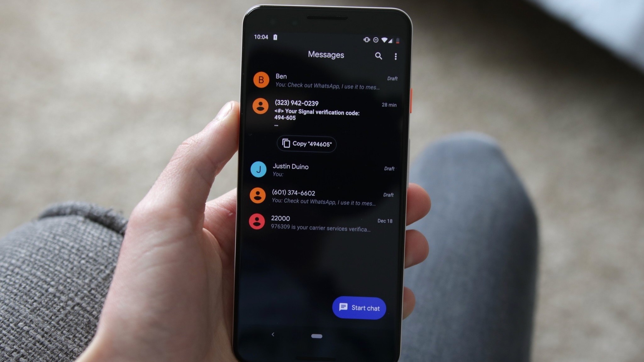
This incremental deployment allows Google’s engineering teams to monitor telemetry data regarding crash rates, animation performance, and user engagement metrics in real time. By isolating the rollout to specific cohorts, Google can identify and patch rendering bugs, layout clipping issues, and memory leaks before committing the interface changes to the stable public branch.
Industry Implications and User Experience Considerations
The ongoing debate over the Google Messages redesign underscores a broader tension in modern mobile software design: the constant tug-of-war between minimalist aesthetics and functional density. As operating system developers strive for visual uniformity across ecosystems, interfaces increasingly adopt spacious layouts, large profile imagery, and prominent whitespace.
For casual users, these changes often translate to a more approachable, less intimidating application environment that aligns with contemporary design expectations set by iOS and modern web standards. For power users and high-volume communicators, however, excessive whitespace and relocated navigational elements can introduce friction, requiring additional taps and scrolls to accomplish routine tasks.
Industry analysts note that Google Messages occupies a unique position in the mobile landscape. As the default messaging client for millions of Android devices worldwide, any interface modification—no matter how minor—has an immediate, large-scale impact on daily digital habits. The integration of RCS as a universal standard further amplifies the app’s importance, bridging the user experience gap between Android and iOS ecosystems.
As the beta testing phase continues, developers and users alike await official word from Google regarding a stable release date. Feedback gathered from the current testing cohort provides Google with a critical window to refine the interface—potentially introducing user-toggleable settings that would allow individuals to switch between compact and expanded pinned chat views. Until a final decision is made, the evolving Google Messages beta serves as a case study in the delicate balancing act required when modernizing a ubiquitous digital communication tool.