Google Wallet gets a major aesthetic overhaul with full-screen pass designs on Android

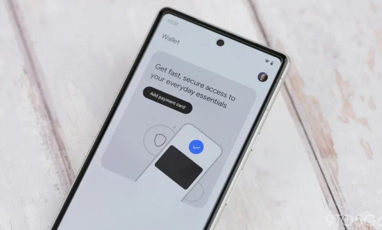
Google Wallet is undergoing a significant visual transformation, moving away from its traditional card-based layout in favor of a more immersive, full-screen interface for digital passes. This update, which follows a major homepage redesign introduced earlier in May 2026, marks the latest effort by Google to refine the user experience of its digital storage ecosystem. As mobile devices increasingly serve as primary repositories for identity, payments, and loyalty programs, Google is clearly prioritizing clarity, accessibility, and visual cohesion.
The new design philosophy shifts the focus from small, centered cards resting against a neutral or Dynamic Color background to an expansive view that fills the entire display. When a user selects a pass, the background of the application now adopts the primary color associated with the brand or service provider. This integration creates a more branded and seamless aesthetic, effectively turning the digital pass into a dedicated landing page rather than a static widget.
The Anatomy of the Redesign
Under the previous interface, users were greeted by a rectangular card, often relegated to the center of the screen, which could feel disconnected from the rest of the application’s UI. The new design eliminates this separation. By extending the brand’s color palette across the entire screen, Google is providing a more premium, unified feel.
Key functional changes accompany this aesthetic shift. Essential actions—such as initiating a phone call to customer support or launching an official website—are now prominently displayed as you scroll down the pass page. This makes the pass more than just a barcode or QR code; it functions as an interactive hub for the specific service it represents.
Furthermore, Google has streamlined the management of these passes. Settings that were previously tucked away in a three-dot overflow menu—such as the ability to assign a custom nickname to a card or manage its specific usage permissions—have been integrated directly into the page. This reduction in "taps to task" is a standard practice in modern UX design, aimed at reducing user friction.
Perhaps most interestingly, Google has included a "rewind" icon in the top-right corner of the interface. This allows power users to revert to the legacy card-based view at any time. This fallback mechanism is a rare but thoughtful inclusion, acknowledging that while design trends change, user preference for familiarity often persists.

Scope of the Rollout and Current Limitations
As of the current rollout phase, the redesign is being applied broadly across loyalty cards and boarding passes, including those created manually by the user. However, not all elements of the Wallet have been touched by this update. Notably, transit cards—which require specific, high-contrast layouts for rapid scanning at turnstiles and readers—continue to utilize the legacy design.
This distinction is logical from a technical standpoint. Transit systems require immediate, consistent scanning reliability. The legacy design, which keeps the pass small and centered, likely reduces the risk of accidental UI elements interfering with scanner sensors. While the new design is aesthetically superior for loyalty cards, it may introduce unnecessary complexity for the high-frequency, high-stakes environment of public transportation.
A Chronology of Google Wallet’s Evolution
To understand the magnitude of this redesign, one must look at the trajectory of Google’s mobile payment and storage efforts over the last decade.
- 2011: Google Wallet is introduced as a peer-to-peer payment and card storage service, primarily leveraging NFC technology.
- 2018: Google consolidates its payment services into Google Pay, shifting focus toward a unified commerce experience.
- 2022: Google pivots back to the "Wallet" branding, re-establishing it as a comprehensive digital hub for transit passes, loyalty cards, event tickets, and identity credentials.
- May 2026: A major homepage redesign introduces advanced search capabilities, allowing users to find specific passes within a growing library of digital assets.
- Late May/June 2026: The current full-screen pass redesign begins its wide rollout, shifting the focus to brand-centric immersive views.
This progression reflects a broader trend in the tech industry: moving away from utility-first interfaces toward content-first, immersive experiences. As users accumulate more digital assets—ranging from health insurance cards to gym memberships—the challenge for Google is no longer just "storing" the data, but organizing it in a way that remains intuitive as the volume of data grows.
Supporting Data and Industry Context
The mobile wallet sector is currently seeing exponential growth. According to industry analysis from late 2025, mobile wallet adoption has reached over 60% of smartphone users in major markets, with consumers shifting from using these platforms strictly for payments to using them for a wide variety of secondary functions.
Data from the first quarter of 2026 suggests that the average user now stores between 12 and 18 passes in their digital wallet, a significant increase from the 4 to 6 passes reported in 2022. This "clutter" necessitated the search-focused homepage update in May and the current move to cleaner, more distinct pass views. By standardizing the design and allowing for better information architecture within each pass, Google is attempting to solve the "finding the right card" problem that plagues frequent wallet users.
Implications of the Immersive Design
While the feedback regarding the aesthetic quality of the update has been largely positive, there are minor concerns regarding accessibility and usability. The reliance on vibrant, brand-specific background colors creates a visually striking interface, but it also introduces potential issues with legibility.

For instance, if a brand uses a particularly bright or neon primary color, it may clash with the system-level text, making the pass difficult to read in certain lighting conditions. Furthermore, users who frequently use passes in low-light environments—such as entering a concert venue or checking into a hotel at night—may find the full-screen brightness somewhat jarring. Google’s commitment to Material You design principles usually mitigates this through dynamic contrast adjustments, but individual brand assets may not always adhere to these standards perfectly.
From a developer and business perspective, the redesign offers a new opportunity for brand presence. Businesses whose passes appear in the wallet now have a larger canvas to showcase their brand identity. By allowing the primary brand color to bleed into the background, Google is indirectly encouraging businesses to optimize their assets for the Wallet platform, potentially leading to a more curated and professional ecosystem.
Analysis of the Strategic Shift
Google’s move to update the Wallet interface is symptomatic of a "Platformization" strategy. By making the Wallet an indispensable tool for daily life—not just a financial tool—Google ensures that users engage with its services multiple times per day. The inclusion of "call" and "website" buttons within the pass view is a direct attempt to keep users within the Google ecosystem rather than forcing them to navigate to a third-party app or a web browser.
The inclusion of the "rewind" icon to revert to the old design suggests that Google is aware of the potential for user friction. It is a strategic hedge: they are pushing forward with a modern, design-heavy interface, but they are providing an exit strategy for users who prioritize the utility of the previous, more compact layout.
Conclusion
The rollout of the full-screen pass design in Google Wallet represents a mature step in the application’s lifecycle. It is no longer a simple digital storage locker; it is a sophisticated interface that prioritizes brand interaction and visual clarity. While transit users will continue to rely on the time-tested, legacy interface for the time being, the shift for loyalty cards and boarding passes indicates a clear intent to elevate the digital wallet from a secondary utility to a primary interface.
As Google continues to iterate on this design, the focus will likely shift to how these passes interact with other Android features, such as the lock screen and the At a Glance widget. For now, users can expect to see their digital wallet become a more colorful, informative, and cohesive part of their mobile experience, provided they are willing to embrace the shift away from the traditional, minimalist card view.