Google Apps on iOS Embrace Liquid Glass Design as Material 3 Integration Accelerates

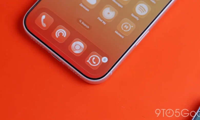
As the Liquid Glass design language marks its first anniversary, Google has initiated a significant aesthetic transition for its software suite on Apple’s iOS platform. By integrating translucent elements alongside the Material 3 Expressive design framework, the company is moving toward a more cohesive, modern visual identity that aligns with the aesthetic expectations of the iOS ecosystem while maintaining Google’s signature design principles. This shift represents a deliberate effort to modernize the user interface (UI) of Google’s most popular applications, moving away from the static, opaque backgrounds that have historically characterized its mobile design language.
The Evolution of Google’s Design Language
Google’s design journey on iOS has been a complex endeavor of balancing internal branding with platform-specific norms. For years, Google utilized the "Google Material Theme," a rigid, clean, and highly functional design system. However, the introduction of Material You and its successor, Material 3, signaled a move toward more personalized and fluid interfaces.
Liquid Glass, which debuted roughly one year ago, serves as a sophisticated evolution of these principles. By leveraging semi-transparency and subtle blurring effects, Liquid Glass allows the underlying content—be it a photograph, a document background, or a user interface element—to bleed through, creating a sense of depth and spatial awareness that was previously absent.
The current update, notably visible in version 7.94 of Google Photos, signifies a pivotal shift. Where the application once featured a stark, solid-colored floating bottom bar, it now adopts a translucent, frosted glass effect. This adjustment is not merely cosmetic; it changes the user’s perception of the app’s hierarchy, allowing the media being viewed to remain the focal point even while navigating the app’s infrastructure.
Chronology of the Material 3 Transition
The migration to Material 3 and Liquid Glass on iOS has been a phased rollout, reflecting the sheer scale of Google’s portfolio.
- Initial Phase (2023–2024): Google began experimenting with Material 3 components, focusing primarily on typography, button shapes, and iconography. During this period, the company maintained the traditional, opaque navigation bars to ensure stability.
- Expansion (Late 2024): As Material 3 matured on Android, the company began drafting plans for cross-platform parity. High-traffic apps like Google Tasks were among the first to receive significant UI overhauls, signaling that a broader change was imminent.
- Liquid Glass Implementation (2025–2026): The current implementation marks the adoption of Liquid Glass as a standard. Applications such as Google Health and the Google Photos suite are now receiving these granular updates. This phase focuses on the "Expressive" nature of the design language, allowing for more dynamic interaction between the UI and the content layer.
Technical Analysis: Transparency and User Control
The recent update to Google Photos introduces a sophisticated handling of transparency. Users are now presented with varying levels of translucency, categorized as "Default" and "More clear." This gives users agency over their visual experience. When set to "More clear," the frosted effect is dialed back, allowing a greater portion of the image behind the navigation bar to remain visible.
![Google combines Material 3 Expressive & Liquid Glass on the iPhone [Gallery]](https://9to5google.com/wp-content/uploads/sites/4/2026/03/Liquid-Glass-dock-on-iPhone-17-Pro-Max.jpg?quality=82&strip=all&w=1600)
In dark mode, the implementation becomes particularly striking. The default blue accent color, characteristic of the Material 3 palette, provides a subtle tint to the active tab indicator. This creates a layered visual experience that feels native to the iOS environment—a significant achievement for a company that has often been criticized for making its apps feel like "Android ports" on Apple hardware.
Google Health has also undergone a similar treatment. The navigation elements now sit atop content with a distinct blur, and the "Ask Coach" floating action button (FAB) has been updated with a frosted finish. These small, meticulous changes reduce the "heaviness" of the UI, making the app feel more lightweight and responsive.
The Missing Piece: The Dynamic Color Debate
Despite these advancements, one critical feature remains absent from the iOS implementation: Dynamic Color. On Android, Dynamic Color—the ability for the UI to extract colors from a user’s wallpaper and apply them across the entire system—is a cornerstone of the Material You experience.
Industry analysts have long debated whether this could or should be implemented on iOS. The current consensus is that without deep, system-level access to the user’s wallpaper and color palette—access that Apple strictly limits for privacy and UI consistency reasons—the implementation of Dynamic Color on iOS would be largely artificial.
If Google were to implement a manual version of this feature, it would require users to choose an accent color that would propagate across all Google apps. While this would offer a degree of personalization, it lacks the "magic" of the Android system, where the interface adapts automatically. Consequently, Google appears to be prioritizing Material 3’s structural and translucent elements, which function independently of the underlying operating system’s color scheme.
Implications for the Google Ecosystem
The integration of Liquid Glass is a strategic move to ensure that Google’s apps remain competitive in a design-conscious market. As Apple continues to refine its own design language—focusing on depth, glass-like effects, and fluid animations—Google’s move to mirror these trends prevents its apps from appearing dated.
Furthermore, the transition indicates that Google is finally completing the phase-out of the older Google Material Theme. While apps like Google Docs, Sheets, and Slides have lagged behind, their inclusion in the broader design overhaul is expected to follow shortly. This transition is vital for developers and designers alike, as it creates a unified design system that is easier to maintain across platforms.
![Google combines Material 3 Expressive & Liquid Glass on the iPhone [Gallery]](https://9to5google.com/wp-content/themes/ninetofive/dist/images/google-preferred-source-badge-dark.png)
From a product design perspective, the move toward Liquid Glass is about reducing the cognitive load. By making the interface semi-transparent, the app feels less like a wall blocking the content and more like a tool facilitating the interaction.
Broader Industry Impact and Future Outlook
The adoption of this design language suggests a mature approach to cross-platform software development. By maintaining a consistent brand identity (Material 3) while respecting platform-specific UI patterns (Liquid Glass on iOS), Google is attempting to solve a decades-old tension between brand recognition and platform loyalty.
Looking ahead, we can expect Google to continue refining these visual elements. As iOS hardware becomes more capable of rendering complex graphical effects in real-time, the translucency and blurring seen in Liquid Glass will likely become more performant and visually complex.
While the company has not provided a public roadmap for the remainder of its iOS suite, the velocity of recent updates suggests that the migration will be completed within the next 12 to 18 months. As the older Material Theme is fully retired, the resulting consistency across the Google suite will likely enhance user satisfaction and solidify the company’s position as a premier developer within the Apple ecosystem.
For the end user, this is a positive evolution. The interface is no longer a static cage for data; it is becoming a fluid, responsive environment that respects the aesthetic nuances of the device it inhabits. Whether through the frosted buttons in the top bar or the refined navigation elements in health-focused apps, Google’s latest design iteration marks a sophisticated step forward in the history of mobile application design.