Motorola Edge 70 Max Emerges as a Powerhouse Despite Software Update Policy Concerns: A Deep Dive

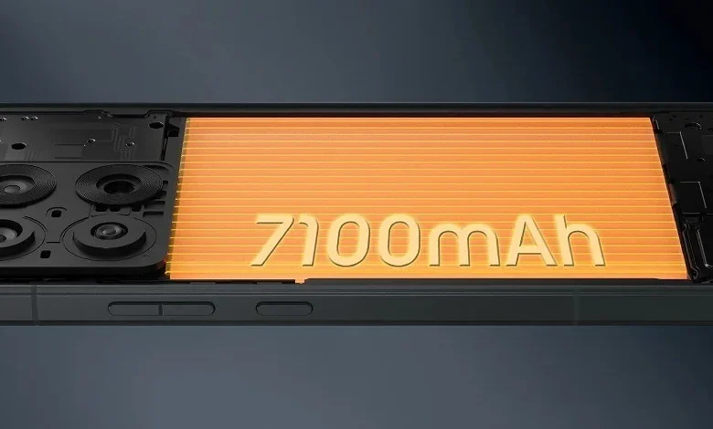
The Motorola Edge 70 Max, a device that has navigated recent controversy surrounding its software update policy, now stands as a particularly intriguing entrant in the competitive smartphone market. With the initial confusion regarding its software support largely clarified, the device distinguishes itself within its own series, and against rivals, through a suite of impressive specifications. At its core, the Edge 70 Max boasts a formidable, albeit forward-looking, Snapdragon 8 Gen 5 chipset, positioning it as the performance leader among the Edge 70 series, which otherwise features Snapdragon 7 and Dimensity 8 series processors. This emphasis on raw power is complemented by an exceptionally large 7,100mAh battery, a capacity that significantly surpasses even the Pro and Pro+ variants of the series, making it the largest battery in the entire lineup and a strong contender for market leadership in endurance.
The Heart of Power: Performance and Endurance
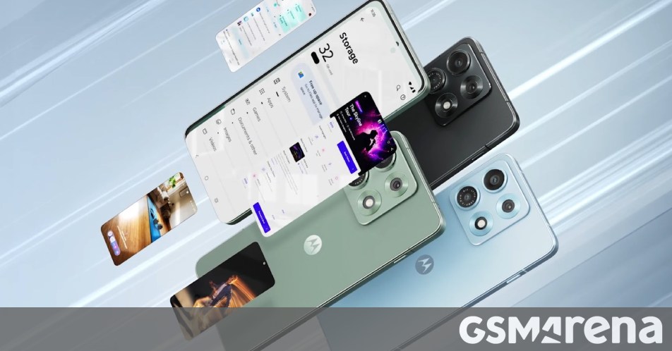
The selection of a Snapdragon 8 Gen 5 chipset, described by Qualcomm in an earlier, hypothetical announcement as a "flagship-killer chip," underscores Motorola’s ambition for the Edge 70 Max. While the specific details of this future-generation processor are speculative, its designation implies a commitment to delivering cutting-edge performance. Such a chipset is expected to offer substantial generational leaps in CPU and GPU performance, critical for demanding applications, high-fidelity gaming, and advanced AI functionalities. Users can anticipate seamless multitasking, rapid application launches, and efficient handling of complex computational tasks, including sophisticated on-device AI operations that enhance everything from photography to system optimization. This level of processing power places the Edge 70 Max in direct competition with current and future flagship devices from other manufacturers, aiming to provide a premium user experience without compromise on speed or responsiveness.
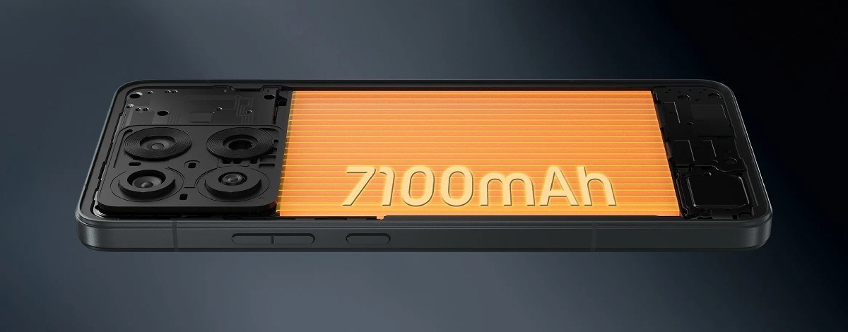
Complementing this powerful processing unit is the phone’s standout 7,100mAh battery. This colossal capacity is a significant differentiator, promising extended usage far beyond what typical smartphones offer. In an era where battery anxiety is a common consumer concern, the Edge 70 Max positions itself as a device capable of easily lasting two days on a single charge for many users, or enduring even the most intensive usage scenarios throughout a demanding day. For professionals, gamers, or heavy media consumers, this translates to unparalleled freedom from power outlets. This massive battery is further enhanced by robust charging capabilities: 90W wired charging provides rapid power replenishment, minimizing downtime. Even more impressively, the device supports 25W wireless charging with proper Qi 2.2 support, complete with magnetic alignment. The integration of Qi 2.2, a next-generation wireless charging standard, alongside magnetic attachment, is a rare feature in the Android ecosystem. This technology not only ensures efficient and faster wireless charging but also offers the convenience and secure alignment akin to Apple’s MagSafe system, providing a superior user experience by eliminating fumbling for precise coil alignment. This combination of extreme battery life and advanced, versatile charging solutions makes the Edge 70 Max a true outlier in the market for power users.
A Visual Feast: Display and Design Excellence
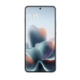
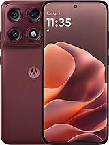
Beyond its internal power, the Motorola Edge 70 Max presents a visually stunning and robust external package. The display is arguably the finest in the series, featuring a expansive 6.82-inch OLED panel. This screen boasts a 1440p+ resolution, delivering exceptionally sharp and detailed visuals, making it ideal for high-definition media consumption, intricate gaming, and detailed productivity tasks. The 144Hz refresh rate ensures incredibly smooth scrolling, fluid animations, and a highly responsive touch experience, which is particularly beneficial for competitive gaming. A key technical advancement is the inclusion of an LTPO (Low-Temperature Polycrystalline Oxide) panel, a technology that allows the display to dynamically adjust its refresh rate from as low as 1Hz up to 144Hz. This adaptive capability significantly improves power efficiency without sacrificing visual fluidity, as the screen can slow down when displaying static content and ramp up instantly for fast-moving visuals.
The display’s advertised peak brightness of 7,000 nits is an astonishing figure, far exceeding most current smartphone displays. While such extreme brightness levels are typically achieved in very small areas for HDR content peaks rather than across the entire screen, it suggests an incredibly vibrant and legible display, even under direct sunlight. This ensures excellent outdoor visibility and a truly immersive HDR viewing experience for compatible content, bringing out fine details and enhancing contrast.
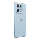
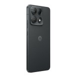
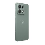
In terms of physical construction, the Edge 70 Max exudes a premium feel. It is built with an aluminum frame, providing both rigidity and a sophisticated aesthetic. The front and back panels are protected by Gorilla Glass 7i, a durable glass designed to resist scratches and drops. While Gorilla Glass Victus 2 is currently the latest widely adopted standard, Gorilla Glass 7i signifies Motorola’s commitment to advanced material science for enhanced device resilience. Furthermore, the phone carries both IP68 and IP69 ratings. An IP68 rating guarantees protection against dust ingress and immersion in water up to 1.5 meters for 30 minutes, offering peace of mind against accidental spills and splashes. The additional IP69 rating denotes protection against high-pressure, high-temperature jets of water, indicating an even greater level of environmental resistance, making the device exceptionally durable for various demanding conditions. Despite these robust features, the device follows a common trend among premium smartphones by omitting a microSD card slot for expandable storage and a 3.5mm headphone jack, features increasingly phased out in favor of cloud storage and wireless audio solutions.
Photography Prowess (or Lack Thereof): The Camera System
While the Motorola Edge 70 Max excels in performance, battery life, and display technology, its camera system presents a more modest offering, particularly when considering its premium price point. The primary camera features a 50MP sensor, specified at 1/1.56 inches, which is a respectable size for capturing good detail and performing adequately in various lighting conditions. This main sensor is capable of recording 4K video at 60 frames per second, allowing for high-resolution and smooth video capture. However, the accompanying lenses are less ambitious: an 8MP ultra-wide camera and a 32MP selfie module.
For a device positioned at the higher end of the market, this camera configuration might be considered "basic." Many competitors in the £700-€800 range often include a dedicated telephoto lens for optical zoom, higher resolution ultra-wide sensors, or more advanced computational photography features. The absence of a telephoto lens, in particular, limits the device’s versatility for capturing distant subjects without digital crop, which inevitably degrades image quality. While the 50MP main sensor is capable, and the 32MP selfie camera should provide detailed self-portraits, the overall camera array may not satisfy users who prioritize advanced photographic capabilities on par with true flagship camera phones. Motorola appears to have made strategic choices, prioritizing other hardware aspects over an expansive and highly specialized camera suite to meet specific cost or design targets for the Max variant.
The Software Conundrum: Updates and Longevity
Perhaps the most significant lingering concern for the Motorola Edge 70 Max, despite its impressive hardware, revolves around Motorola’s software update policy. This issue initially sparked a considerable debate, highlighting a broader problem with how some manufacturers communicate and execute long-term software support for their devices. Initially, there was ambiguity regarding the number of Android OS updates the Edge 70 Max would receive, with reports fluctuating between two and three major versions. Similarly, the duration of security patch support was unclear, ranging from three to five years. This lack of concrete commitment from Motorola caused apprehension among prospective buyers, especially for a device with a premium price tag.
Following public scrutiny, Motorola issued a clarification, attempting to address these concerns. However, even with the clarification, a degree of uncertainty appears to persist. For a phone costing £700 or €800, consumers reasonably expect a clear and robust update commitment, typically aligning with industry leaders like Samsung and Google, who now offer four to seven years of OS and security updates for their flagship devices. The disparity in Motorola’s policy – or the lack of definitive communication – can impact consumer confidence and the perceived long-term value of the device. Timely and consistent software updates are crucial not only for new features and performance enhancements but, critically, for maintaining security against evolving cyber threats. A less-than-stellar update policy can diminish the device’s appeal, potentially leading to faster obsolescence and reduced resale value, which are significant considerations for an expensive smartphone. Motorola’s official stance, even after clarification, has been interpreted by some as still lacking the transparency and longevity offered by key competitors, suggesting an area where the company needs to further solidify its commitment to user experience and device longevity.
Pricing and Market Position
The Motorola Edge 70 Max enters the market with a premium pricing structure, reflecting its high-end specifications. In the UK, the 8GB RAM/256GB storage variant is priced at £700, while in the EU, it retails for €800. For the Indian market, prices range from ₹55,000 for the 8GB/256GB model to ₹60,000 for the 12GB/256GB configuration.
An important factor influencing the perceived value, particularly in Europe, is the inclusion of free bundled accessories: a pair of Moto Buds Loop and a charger (either 90W or 125W, depending on the region). This addition can significantly enhance the overall value proposition, as these accessories would typically represent a separate cost. However, even with these additions, the Edge 70 Max is positioned in a highly competitive segment, competing with established flagships and "flagship killers" from brands like Samsung, OnePlus, Xiaomi, and Google. Its distinct selling points—the immense battery, advanced charging, and a top-tier hypothetical processor—aim to carve out a niche for power users and those prioritizing endurance. However, the conservative camera system and the contentious software update policy present challenges to its broad market appeal against rivals offering more balanced packages or stronger software commitments.
Internal Competition: The Edge 70 Series Siblings
The Motorola Edge 70 Max doesn’t just compete with external rivals; it also faces internal competition from its siblings, the Motorola Edge 70 Pro and Edge 70 Pro+. These devices, while sharing the series name, offer different configurations and cater to slightly varied preferences, potentially creating a dilemma for consumers.
The Motorola Edge 70 Pro, for instance, launched at €800/£750, placing it in a similar price bracket to the Max. While its Dimensity 8500 Extreme chipset is described as one of the fastest mid-range chips, it doesn’t match the hypothetical flagship performance of the Snapdragon 8 Gen 5 in the Max. However, the Pro excels in photographic capabilities, featuring a more advanced camera setup. It boasts a 50MP 3.5x/81mm telephoto camera, offering genuine optical zoom, and an upgraded 50MP ultra-wide sensor, providing greater versatility and higher quality for varied photographic scenarios. The Edge 70 Pro’s battery is a respectable 6,500mAh, coupled with 90W wired and 15W wireless (non-magnetic) charging. While its battery is smaller than the Max, and wireless charging is less advanced, its camera system presents a strong argument for users prioritizing photography.

The Motorola Edge 70 Pro+, which is the regional variant of the Pro specifically for the Indian market, starts at ₹48,000. This makes it a more affordable option than the Max in India, while still offering the Pro’s superior camera hardware. The strategic placement of these devices within the same series highlights Motorola’s attempt to offer choice, but it also means consumers must carefully weigh their priorities—is it raw power and unparalleled battery life (Max) or a more capable and versatile camera system (Pro/Pro+)? The pricing strategy, especially the similar price points between the Max and Pro in some regions, suggests Motorola is betting on distinct user profiles for each device rather than a clear hierarchical upgrade path.
Broader Industry Context and Motorola’s Strategy
The Motorola Edge 70 Max represents a fascinating strategic move for Motorola in the premium smartphone segment. Historically, Motorola has often been perceived as a brand strong in the mid-range and budget categories, offering clean Android experiences at competitive prices. With the Edge series, and particularly the Edge 70 Max, the company is clearly aiming to re-establish a significant presence in the higher echelons of the market. The device’s focus on a hypothetical top-tier processor, an exceptionally large battery, cutting-edge charging technology (especially magnetic wireless), and a high-quality display indicates a desire to innovate and differentiate itself from the crowded field.
This strategy, however, comes with inherent challenges. The premium segment is dominated by entrenched players with strong brand loyalty and often superior camera systems, which remain a key differentiator for many high-end consumers. Motorola’s decision to offer a more basic camera setup on the Max, while compensating with other powerful features, suggests a targeted appeal rather than a broad flagship assault. The ongoing issue with software update clarity also underscores a critical area where Motorola needs to build stronger trust with consumers, as long-term support is a non-negotiable expectation for expensive devices.
The Edge 70 Max could be a test case for Motorola, exploring if a focus on "power user" features like extreme battery life and top-tier performance, coupled with unique charging innovations, can successfully draw users away from competitors. Its success will depend not only on its hardware prowess but also on how effectively Motorola addresses the software longevity concerns and how it positions the device’s unique selling points against its internal siblings and external rivals.
In conclusion, the Motorola Edge 70 Max emerges as a compelling, albeit complex, device. Its theoretical Snapdragon 8 Gen 5 chipset, colossal 7,100mAh battery with advanced magnetic wireless charging, and stunning LTPO OLED display make it a powerhouse for performance and endurance. However, its more conservative camera system and, crucially, the lingering questions surrounding Motorola’s software update commitment, temper its appeal. For consumers prioritizing raw power, exceptional battery life, and innovative charging, the Edge 70 Max presents a unique proposition. Yet, for those who demand a comprehensive, top-tier camera experience and assured long-term software support, a careful consideration of alternatives, including its own Edge 70 Pro sibling, remains essential. The ultimate impact of the Edge 70 Max will be a testament to whether its distinct strengths can overcome its perceived weaknesses in a fiercely competitive market.